« Previous 1 2
Creating reports with JasperReports
Report Card
More Data
At this point, the contents of the report show the results of exactly one SQL query. This may be sufficient in some cases, but a database that cannot be mapped with one single query is more typical, and Max has several options.
The first option I will look at here is again based on a single query whose results are distributed across different report elements. To accomplish this, Max queries a table or view in his enterprise resource planning database, in which columns list individual products, and rows contain daily sales volumes (Listing 2).
Listing 2
Sales Table
mysql> select * from sales;
+------------+----------+----------+----------+
| rdate      | product1 | product2 | product3 |
+------------+----------+----------+----------+
| 2015-03-02 |      577 |     284  |      156 |
| 3/3/2015   |      566 |     291  |      116 |
...
Max again starts with a blank A4 template. In this report, he wants to create graphics with daily sales figures for two products. No Detail band is required because the data record does not need to be listed line by line for this. Max only keeps the Title, Page Header, Column Header, Column Footer, and Page Footer bands.
Previously, he used the query with the data source definition
SELECT DATE_FORMAT(rdate, "%d.%m.%Y") \
  AS date, product1, product2, product3 FROM sales;
After doing this, he does not immediately click on Finish
in the New Report Wizard. Instead, he clicks Next
and ends up on a page where he can transfer all or individual dataset fields (here, date, product1, product2, and product3) to the fields that are then available for designing the charts. Max applies all the fields. In the next step, he could select fields to group by, which is not necessary here. This completes the wizard process.
Max designs the title with a logo and heading much like the last report. He then drags the chart element from the palette into the Column Header band. This opens a selection window that offers a wide variety of chart types – bar chart, pie chart, Gantt chart, and so on.
Max selects Line Chart
and ends up on a page where he can define where the values for the two axes come from – the options are the fields that he chose above from the dataset fields. Not all fields are now required for the diagram – just a subset. Max chooses $F{product1} for the y
-axis and $F{date} for the x
-axis.
Next, he scales the diagram to the size of the band and places a static text field with a heading in the top Page Header band. Max then takes a first look in the Preview tab. In principle, everything is already working; however, the x -axis label (i.e., the date) cannot be read because the entries overlap, and a legend is not needed for a plot like this.
Both of these elements can be adjusted easily via diagram properties, with which all the display details can be changed. The x -axis label can be rotated through 30 degrees via Properties | Chart Plot | Category Axis Tick Label Font | Category Axis Tick Label Rotation so that the date marks no longer overlap. Additionally, the legend can be removed using Properties | Chart | Show Legend , which is False (Figure 5).
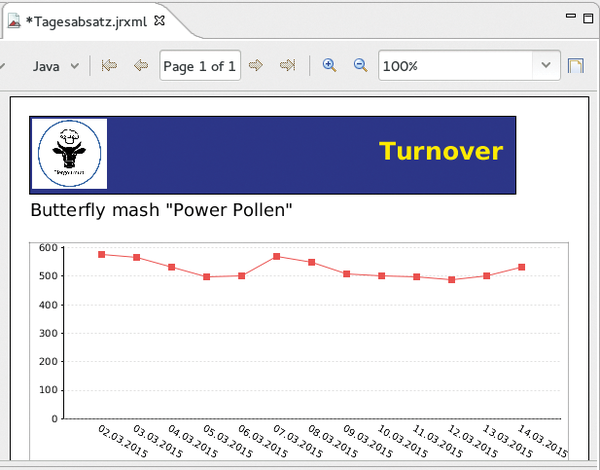 Figure 5: The finished first chart in the report. A second report can be generated by following the same approach.
Max can now arrange a new heading and another chart for the sales figures of a second product in the two free bands following exactly the same approach. This can be done simply by selecting product2 for the y -axis values when configuring the chart. In this way, he can include as many different charts in a report as the product columns he specifies in his database query, and as many free bands as he still has for the charts.
No Limits
The next technique overcomes the limitations with regard to the number of data columns from a query and the free bands. Max simply drags the Subreport element from the palette into a free band. This step creates a report within a report and starts all over again: A new template can be selected, which in turn has all the bands available that a new report would have. Max can then define a new data source that can relate to a completely different query against a completely different table.
Max is able not only to place subreports in any free band (except for the Detail band) of a top-level report, but he can also nest them (i.e., create sub-subreports). Thus, there are almost no restrictions regarding design freedom.
Conclusion
JasperReports holds an entire array of possibilities that have not been discussed here: other chart types, maps, crosstabs, and more. The server can process any generated report on demand and can also accept parameters, such as a time interval, when calculating the report.
With JasperReports, you can reference anything that can somehow be expressed in numbers, charts, or tables to create continuously updatable, visually appealing reports with a uniform design and manageable overhead.
Infos
- Community version download page: https://community.jaspersoft.com/download
« Previous 1 2
Buy this article as PDF
(incl. VAT)
Buy ADMIN Magazine
US / Canada
UK / Australia
Related content
-
Enterprise resource planning and customer relationship management with open source
 Modern enterprises require powerful ERP and CRM solutions to manage processes, but the high cost of proprietary solutions can be prohibitive. We look at some open source options.
 -
Export and analyze Azure AD sign-in and audit logs
 The relevant sign-in and audit logs in Azure Active Directory can be exported to external data sources to provide not only long-term archiving, but also the freedom to analyze the stored data.
 -
Open Virtualization Alliance
The Open Virtualization Alliance was founded three months ago to raise awareness about kernel-based virtualization and promote the adoption of KVM in the enterprise. We stopped in for a progress report.
-
Five graphical database front ends
 Skillfully formulated SQL statements are not everyone's favorite pastime. But graphical front ends can help manage data, so even newcomers will benefit from complex data collections.
 -
Data Analysis with R and Python
 The statistical programming language R dissects its database in a masterful way, and you can embed your R in Python using the Rpy2 interface.
Subscribe to our ADMIN Newsletters
Subscribe to our Linux Newsletters
Find Linux and Open Source Jobs
Most Popular
Support Our Work
ADMIN content is made possible with support from readers like you. Please consider contributing when you've found an article to be beneficial.