
One tool you can use to monitor the performance of storage devices is iostat. In this article, we talk a bit about iostat, introduce a Python script that takes iostat data and creates an HTML report with charts, and look at a simple example of using iostat to examine storage device behavior while running IOzone.
Monitoring Storage Devices with iostat
If you are a system administrator of many systems, or even of just a desktop or laptop, you are likely monitoring your system in some fashion. This is particularly true in high-performance computing because the focus is on squeezing every little bit of performance from the system. Unfortunately, one of the system aspects routinely ignored is storage.
A few years ago I wrote an article introducing iostat. I started the article with a rant about the poor state of storage monitoring tools. The current state isn't much better than when I wrote the article, but I still see a large number of people who do not monitor their storage at all. (At a minimum, you should be using GKrellM to monitor the storage in your desktop.) However, a few tools can help you monitor or understand your storage. Plus, some simple scripts can easily be written that take the output from these tools and create a graphical view of various aspects of the system.
In this article, I want to review iostat, a tool for monitoring your storage devices, and briefly show you how to use it. Then, I want to present a simple Python script I wrote to parse the data, plot it, and create an HTML report. This script illustrates what can be done to add graphical analysis capabilities to command-line-based tools. Finally, I want to use iostat and this script to examine the behavior of a storage device while running IOzone.
iostat
The iostat command-line tool is part of the sysstat family of tools that comes with virtually every distribution of Linux. If you are not familiar with the sysstat tools, they are a collection of tools for monitoring various aspects of your system. They consist of:
The output from iostat can vary depending on the options you chose, but some sample output is shown in Listing 1.
Listing 1: Sample iostat Output
[laytonj@home8 IOSTAT]$ iostat -c -d -x -t -m /dev/md1 2 100
Linux 2.6.18-308.16.1.el5.centos.plus (home8)

01/31/2013      _i686_  (1 CPU)01/31/2013 09:56:01 AM
avg-cpu:  %user   %nice %system %iowait  %steal   %idle
          14.78    0.38    3.47    2.16    0.00   79.21

Device:         rrqm/s   wrqm/s     r/s     w/s    rMB/s    wMB/s avgrq-sz avgqu-sz   await r_await  w_await  svctm  %util
md1               0.00     0.00    0.04    0.05     0.00     0.00     8.17     0.00    0.00    0.00     0.00   0.00   0.00

01/31/2013 09:56:03 AM
avg-cpu:  %user   %nice %system %iowait  %steal   %idle
           6.00    0.00    2.00    0.50    0.00   91.50

Device:         rrqm/s   wrqm/s     r/s     w/s    rMB/s    wMB/s avgrq-sz avgqu-sz   await r_await  w_await  svctm  %util
md1               0.00     0.00    0.00    0.00     0.00     0.00     0.00     0.00    0.00    0.00     0.00   0.00   0.00

01/31/2013 09:56:05 AM
avg-cpu:  %user   %nice %system %iowait  %steal   %idle
          55.00    0.00   13.50    0.00    0.00   31.50

Device:         rrqm/s   wrqm/s     r/s     w/s    rMB/s    wMB/s avgrq-sz avgqu-sz   await r_await  w_await  svctm  %util
md1               0.00     0.00    0.00    0.00     0.00     0.00     0.00     0.00    0.00    0.00     0.00   0.00   0.00
The command I used takes a snapshot of the status of the device /dev/md1, which is a software RAID-1 device I use for the home directory on my desktop. I told iostat to capture the data every two seconds (this is the 2 after the device) and do it 100 times (this is the 100 at the end of the command). This means I captured 200 seconds of data in two-second intervals. The -c option displays the CPU report, -d displays the device utilization report, -x displays extended statistics, -t prints the time for each report displayed (good for getting a time history), and -m displays the statistics in megabytes per second (MB/s in the output).
To begin, iostat prints some basic output about the system (first line in the output file) and then starts writing the status of the device. Using the options of the previous example, each status has three parts: (1) the time stamp, (2) the CPU status, and (3) the device status. Each status has a set of column labels corresponding to the measurement (they are wrapped in the output above).
The CPU status line has just a few columns of output (the man pages for iostat were used for the list below):
- %user: The percentage of CPU utilization that occurred while executing at the user level (this is the application usage).
- %nice: The percentage of CPU utilization that occurred while executing at the user level with nice priority.
- %system: The percentage of CPU utilization that occurred while executing at the system level (kernel).
- %iowait: The percentage of time that the CPU or CPUs were idle during which the system had an outstanding disk I/O request.
- %steal: The percentage of time spent in involuntary wait by the virtual CPU or CPUs while the hypervisor was servicing another virtual processor.
- %idle: The percentage of time that the CPU or CPUs were idle and the systems did not have an outstanding disk I/O request.
Note that the CPU values are system-wide averages for all processors when your system has more than one core (which is pretty much everything today, except for my old desktop). Device status output is a bit more extensive and is listed in Table 1 (again, using the man pages for iostat).
Table 1: Device Status Output
| Units | Definition |
| rrqm/s | The number of read requests merged per second queued to the device. |
| wrqm/s | The number of write requests merged per second queued to the device. |
| r/s | The number of read requests issued to the device per second. |
| w/s | The number of write requests issued to the device per second. |
| rMB/s | The number of megabytes read from the device per second. (I chose to used MB/s for the output.) |
| wMB/s | The number of megabytes written to the device per second. (I chose to use MB/s for the output.) |
| avgrq-sz | The average size (in sectors) of the requests issued to the device. |
| avgqu-sz | The average queue length of the requests issued to the device. |
| await | The average time (milliseconds) for I/O requests issued to the device to be served. This includes the time spent by the requests in queue and the time spent servicing them. |
| r_await | The average time (in milliseconds) for read requests issued to the device to be served. This includes the time spent by the requests in queue and the time spent servicing them. |
| w_await | The average time (in milliseconds) for write requests issued to the device to be served. This includes the time spent by the requests in queue and the time spent servicing them. |
| svctm | The average service time (in milliseconds) for I/O requests issued to the device. Warning! Do not trust this field; it will be removed in a future version of sysstat. |
| %util | Percentage of CPU time during which I/O requests were issued to the device (bandwidth utilization for the device). Device saturation occurs when this values is close to 100%. |
These fields are specific to the set of options used, as well as the device. A simple example of this is that I used the -m option, which outputs the measurements in units of MB/s instead of KB/s.
Reporting iostat Output with Plots
Many of us have been using the command line for many years and are adept at interpreting the results. However, as an experiment, try looking at the time history output from a long-running command. It's impossible, even with eidetic memory. Moreover, I like to look at various parameters relative to each other, so I can get a better feel for how things are interacting within the system. Consequently, I decided to write a simple Python script that parses through the iostat output and creates the plots I like to see. Taking things a little further, the script creates HTML so I can see the plots all in one document (and either convert it to pdf or to Word).
The script, IOstat_plotter, can be downloaded and run easily. It uses a few Python modules: shlex, time, matplotlib, and os.
I tested IOstat_plotter with Matplotlib 0.91 and a few others to make sure it worked correctly. I tested on a couple versions of Python – 2.6.x and 2.7.x – but not on Python 3.x. I tried to keep the script simple and basic, so it should just work (famous last words), but I offer no guarantees. One last comment about the script: I know lots of people won't like my style or that say I’m not “Pythonic” enough. My answer is that I totally agree. My goal was to create something that easily allowed me to view iostat data. If you have suggestions on making the code better, I would dearly love to hear them – if they are accompanied by some code and not just general comments. (As I hold up the Vulcan greeting with my right hand, just let me say, “talk to the hand because the ears aren't listening.”)
I did hard code some aspects in the script to look for some specific output. The specific iostat command I used is:
[laytonj@home8 IOSTAT]$ iostat -c -d -x -t -m /dev/md1 2 100 > iostat.out
The number of samples and the sampling rate (last two numbers) can be anything. Also the device, which in this case is /dev/md1 (a software RAID-1 device consisting of two SATA disks), can be any disk device or disk partition you want. The output file, iostat.out in the command line above, is also arbitrary. Other than that, I suggest leaving the options as they are. However, if you feel industrious, it’s pretty easy to change the script to allow output in KB/s or other units or even to allow it to “autodetect.”
Once iostat is done gathering data, running the script is simple:
[laytonj@home8 IOSTAT]$ ./iostat_plotter.py iostat.out
The command line argument is the iostat output file (in this example, iostat.out). The script will print some basic information about what it is doing as it runs. It creates a subdirectory, HTML_REPORT, from the current working directory and puts the plots along with a file named report.html in that subdirectory. Once the script is done, just open report.html in a browser or a word processor (e.g., LibreOffice). The HTML is simple, so any browser should work (if it does barf on the HTML, you have a seriously broken browser).
Note that all plots use time as the x-axis data. This data is also normalized by the start time of the iostat run; therefore, all plots will start with 0 on the x-axis. This can be changed in the script if you like.
Example
To illustrate what iostat can do, I ran it while I was doing a write/rewrite test with IOzone. The listing below is the set of commands I used:
date
iostat -c -d -x -t -m /dev/sda1 1 250 > iozone_w_iostat_sda1.out&
sleep 10
./iozone -i 0 -r 64k -s -3g -e -w > iozone.out
sleep 10
date
I put the two sleep commands in the script so I could get some “quiet” data before and after the run. (Note: Sometimes it’s good to look at what the device is doing for some time before and after the critical time period to better understand the state of the device(s) before the time of interest.) The output from iostat is sent to a file, iozone_w_iostat_sda1.out. This is the file used by iostat_plotter to parse the data and plot it. I am also using iostat to monitor the device /dev/sda1, which is one of the disks in a RAID-1 group of two disks. I did this to get more information on what the storage devices are doing because running iostat against /dev/md1 doesn't show as much detail as running it against a physical device.
Next, I ran iostat_plotter against the iostat output file. The generated HTML report is listed below.
********************* Begin report *********************
Introduction
This report plots the iostat output contained in file: iozone_w_iostat_sda1.out. It contains a series of plots of the output from iostat that was captured. The report is contained in a subdirectory HTML_REPORT. In that directory you will find a file name report.html. Just open that file in a browser and you will see the plots. Please note that all plots are referenced to the beginning time of the iostat run.
IOstat outputs a number of basic system parameters when it creates the output. These parameters are listed below.
- System Name: home8
- OS: Linux
- Kernel: 2.6.18-308.16.1.el5.centos.plus
- Number of Cores 1
- Core Type _i686_
The iostat run was started on 02/03/2013 at 15:59:00 PM.
Below are hyperlinks to various plots within the report.
- CPU Utilization
- IOwait Percentage Time
- Steal Percentage Time
- Idle Percentage Time
- Read Throughput and Total CPU Utilization
- Write Throughput and Total CPU Utilization
- Read Requests Complete Rate, Write Requests Complete Rate, and Total CPU Utilization
- Read Requests Merged Rate, Write Requests Merged Rate, and Total CPU Utilization
- Average Request Size, Average Queue Length, and Total CPU Utilization Percentage
- Average Read Request Time, Average Write Request Time, and Total CPU Utilization
- Percentage CPU Time for IO Requests and Total CPU Utilization
1. Percentage CPU Time (CPU Utilization)
This figure plots three types of CPU Utilization: (1) User, (2) System, and (3) Nice. The User utilization is the percentage of CPU utilization that occurred while executing at the user level (applications).The System utilization is the percentage of CPU utilization that occurred while executing at the system level (kernel). The third time is the Nice utilization which is the percentage of CPU utilization that occurred while executing at the user level with nice priority.
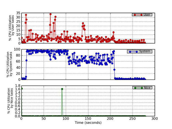
Figure 1 - Percentage CPU Utilization (User, System, and Nice)
2. IOWait Percentage Time
This is the percentage of time that the CPU or CPUs were idle during which the system had an outstanding disk device I/O request.
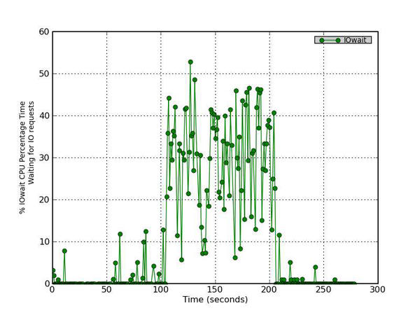
Figure 2 - Percentage CPU Time waiting to process disk requests
3. Steal Percentage Time
This is the percentage of time spent in involuntary wait by the virtual CPU or CPUs while the hypervisor was servicing another virtual processor.
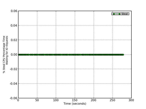
Figure 3 - Percentage CPU Time in involuntary waiting
4. Idle Percentage Time
This is the percentage of time that the CPU or CPUs were idle and the system did not have an outstanding disk I/O request.
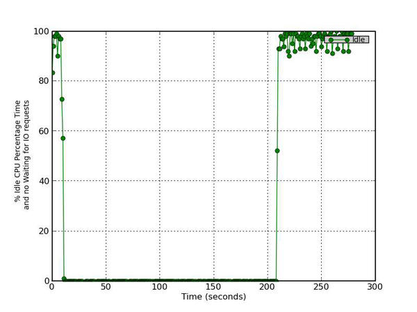
Figure 4 - Percentage CPU Time in idle activities with no IO requests
5. Read Throughput and Total CPU Utilization
This figure has two parts. The top graph plots the Read Rate in MB/s versus time and the bottom graph plots the Total CPU Utilization percentage (User Time + System Time).
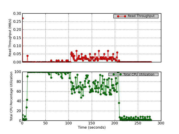
Figure 5 - Read Throughput (MB/s) and Total CPU Utilization Percentage
6. Write Throughput and Total CPU Utilization
This figure has two parts. The top graph plots the Write Rate in MB/s versus time and the bottom graph plots the Total CPU Utilization percentage (User Time + System Time).
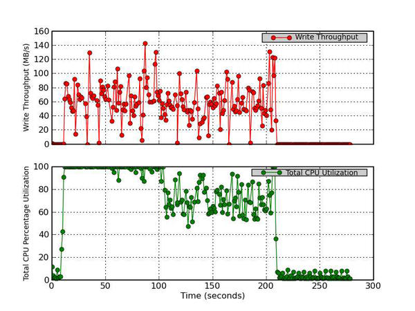
Figure 6 - Write Throughput (MB/s) and Total CPU Utilization Percentage
7. Read Requests Complete, Write Requests Complete, and Total CPU Utilization
This figure has three parts. The top graph plots the number (after merges) of read requests completed per second for the device versus time. The middle graph plots the number (after merges) of write requests completed per second for the device versus time. The bottom graph plots the Total CPU Utilization percentage (User Time + System Time).
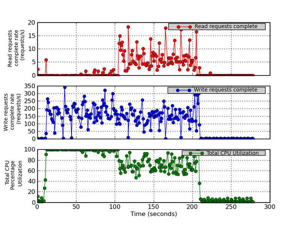
Figure 7 - Read Requests Completed Rate (requests/s), Write Requests Completed Rate (requests/s), and Total CPU Utilization Percentage
8. Read Requests Merged rate, Write Requests Merged rate, and Total CPU Utilization
This figure has three parts. The top graph plots the number of read requests merged per second that were queued to the device. The middle graph plots the number of write requests merged per second that were queued to the device. The bottom graph plots the Total CPU Utilization percentage (User Time + System Time).
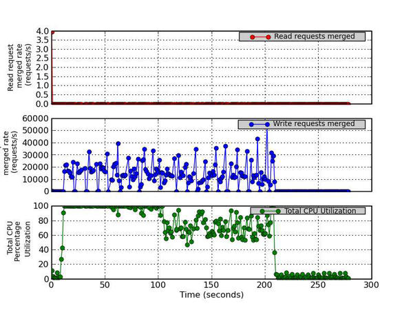
Figure 8 - Read Requests Merged Rate (requests/s), Write Requests Merged Rate (requests/s), and Total CPU Utilization Percentage
9. Average Request Size, Average Queue Length, and Total CPU Utilization
This figure has three parts. The top graph plots the average size (in sectors) of the requests that were issued to the device. The middle graph plots the average queue length of the requests that were issued to the device. The bottom graph plots the Total CPU Utilization percentage (User Time + System Time).
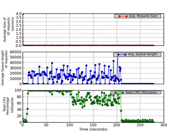
Figure 9 - Average Request Size (sectors), Average Queue Length, and Total CPU Utilization Percentage
10. Average Read Request Time (ms), Average Write Request Time (ms), and Total CPU Utilization
This figure has three parts. The top graph plots the average time (in milliseconds) for read requests issued to the device to be served. This includes the time spent by the requests in queue and the time spent servicing them. The middle graph plots the average time (in milliseconds) for write requests issued to the device to be served. This includes the time spent by the requests in queue and the time spent servicing them. The bottom graph plots the Total CPU Utilization percentage (User Time + System Time).
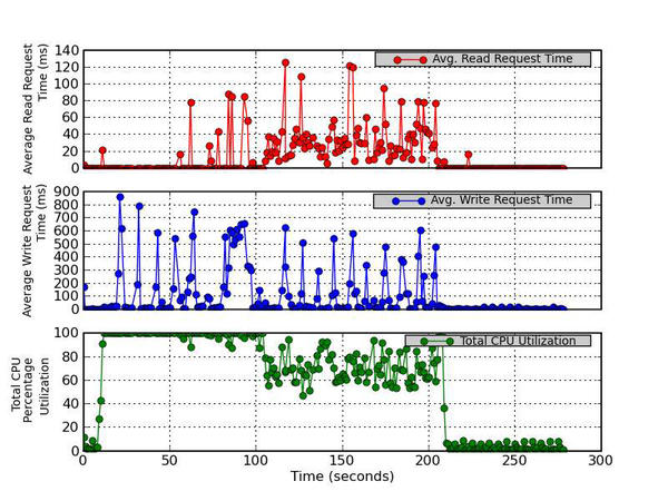
Figure 10 - Average Read Request Time (ms), Average Write Request Time (ms), and Total CPU Utilization
11. Percentage CPU Time for IO Requests and Total CPU Utilization
This figure has two parts. The top graph plots the percentage of CPU time during which I/O requests were issued to the device (bandwidth utilization for the device). Device saturation occurs when this value is close to 100%. The bottom graph plots the Total CPU Utilization percentage (User Time + System Time).
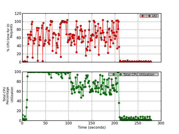
Figure 11 - Percentage CPU Time for IO Requests and Total CPU Utilization
********************* End report *********************
To understand what iostat is communicating, I’ll walk you through the report.
1. Percent CPU Time (CPU Utilization)
The first plot is about CPU utilization (Figure 1). The three graphs plot the user CPU percentage, the percentage of CPU utilization that occurs while executing at the user level (applications); the system CPU percentage, the percentage of CPU utilization that occurs while executing at the system level; and the nice CPU percentage, the percentage of CPU utilization that occurs while executing at the user level with nice priority. In the figure, you can see that the user CPU utilization isn’t too high, but it is definitely noticeable. However, you can see that the system CPU percentage (i.e., the kernel) is greater than 60% during most of the run. In fact, it is close to 100% during the write test in IOzone and around 60%–80% during the rewrite test. Also notice that at around 90 seconds or so, a nice task uses about 1.6% of the CPU. Although this is pretty low, it illustrates that you shouldn’t ignore CPU utilization by nice tasks.
2. Percent IOWait Time
The second plot (Figure 2), plots the iowait CPU percent time. Recall that iowait is the percentage of time that the CPU or CPUs are idle while the system has an outstanding disk I/O request; that is, the percentage of time the CPUs have to wait on the disk. This is a useful plot for illustrating what is happening with the device. For this particular example, once IOzone starts running, this number increases to the 40%–50% range. This means that there are some outstanding I/O requests during which the system is idle (i.e., it’s waiting for the I/O requests to complete). This indicates that applications are hitting this storage device reasonably hard.
3. Percent Steal Time
The third plot (Figure 3) shows the steal CPU percentage versus time, which is the percentage of time spent in involuntary wait by the virtual CPU or CPUs while the hypervisor services another virtual processor. You can see by the metrics (zero) that I’m not running a virtualized system, so this plot isn’t that useful in this case.
4. Percent Time Idle
Figure 4 plots the percentage of CPU time that is idle and without I/O requests, which is a good measure of system idleness. While applications are running, the CPU(s) are not idle or waiting with no I/O requests, meaning the device(s) were very busy during. After the run is complete, this metric jumps to close to 100%, indicating that there is idle CPU time and no outstanding I/O requests.
5. Read Throughput and Total CPU Utilization
Figure 5, is the first of the I/O device metrics plots. The top part of the plot is the read throughput (MB/s) versus time, and the bottom chart is the percent total CPU utilization, which is the sum of user utilization and system utilization (see Figure 1). I like to plot these two metrics together so I can see whether the CPU is busy at the same time as the read throughput. From this plot, it is pretty easy to see that almost no read operations are happening. However, a very small amount occurs during the rewrite phase of IOzone.
6. Write Throughput and Total CPU Utilization
Figure 6 is very similar to Figure 5, but it plots the write throughput versus time as well as the total CPU percent utilization. I didn’t put the read and the write throughput on the same plot, so I could better see how each I/O function was behaving. (Maybe I need to add another chart that has both read and write throughput?) Figure 6 matches the IOzone run because you can see the large peaks in write throughput. The top graph plots the write rate (MB/s) versus time, and the bottom graph plots the total CPU utilization percentage (user time + system time). The device I’m measuring, /dev/sda1, is a disk that is part of a software RAID-1 group, so I don't expect much from it in terms of performance. What I like about Figure 6 is that I can see the write throughput greatly increase about the same time the CPU percent utilization increases. Sometimes I also like to see a plot of write throughput versus iowait, so I can see how write performance corresponds to the percentage of time waiting on I/O requests.
7. Read Requests Completed, Write Requests Completed, and Total CPU Utilization
The next set of plots present some deeper device metrics and might be a little more difficult to interpret. Figure 7 plots the read and write requests that have been completed, along with the CPU utilization. The top graph plots the number (after merges) of read requests completed per second for the device versus time, the middle graph plots the number (after merges) of write requests completed per second for the device versus time, and the bottom graph plots the total CPU utilization percentage (user time + system time). These metrics are given in requests completed per second. If this number is large, you know the system is processing the I/O requests quickly (which is good). It is good to compare Figures 5 and 6 to Figure 7 so you can see whether the system is completing I/O requests and how it relates to throughput. For example, if you are seeing lots of requests completed but throughput is low, it might mean that the device is busy servicing small I/O requests.
8. Read Requests Merged Rate, Write Requests Merged Rate, and Total CPU Utilization
Current disk drives are capable of taking multiple I/O requests and merging them together into a single request. Although this can sometimes improve throughput, it can also increase latency. In Figure 8, the top graph plots the number of read requests merged per second that were queued to the device, the middle graph plots the number of write requests merged per second that were queued to the device, and the bottom graph plots the total CPU utilization percentage (user time + system time). In the case of read requests merging, nothing is really happening because almost no read operations are happening. However, the write merge requests (middle graph) are fairly high. [Note: The y-axis labels are truncated because of the large y-axis values. It should read “Write request merged rate (requests/s).”] You can see that a large number of write requests are merged, but this is to be expected because it is a sequential I/O test with a 64KB transfer size. Because this transfer size is fairly small, I fully expect the device to merge requests (as seen in the middle graph).
9. Average Request Size, Average Queue Length, and Total CPU Utilization
Figure 9 plots the average size of the I/O requests to the device (top graph), the average queue length for I/O requests (middle graph), and the total CPU percent utilization (user time + system time; bottom graph). Interestingly, the average I/O request size (in sectors) is essentially zero (I’m not sure why); however, the middle graph, which plots the average queue length of requests, is definitely non-zero. You can see that the queue depth gets fairly large as the IOzone test continues.
10. Average Read Request Time (ms), Average Write Request Time (ms), and Total CPU Utilization
Figure 10 is a companion to Figure 9 and plots the average read time request in milliseconds (top graph), including the time spent by the requests in queue and the time spent servicing them; the average write request time in milliseconds (middle graph), including the time spent by the requests in queue and the time spent servicing them; and the total CPU utilization percentage (user time + system time; bottom graph). A few read requests are made as part of the rewrite test, and the top chart shows that the average time for a read request is fairly small. However, the middle graph, which plots the average write request time in milliseconds, has some reasonably large values, approaching 900ms.
11. Percent CPU Time for I/O Requests and Total CPU Utilization
The last plot, Figure 11, plots in the top graph the percentage of CPU time during which I/O requests were issued to the device (bandwidth utilization for the device). The bottom graph plots the total CPU utilization percentage (user time + system time). In essence it is a plot of the bandwidth utilization of the device. If this value approaches 100% then the device is saturated. If the value is low, the device has remaining capability. For this test, notice that some of the values go just above 100%, illustrating that the device is saturated at those points and cannot deliver any more performance.
Observations and Comments
Iostat is a popular tool that is part of the sysstat tool set that comes with virtually all Linux distributions, as well as other distributions. Consequently, I think it is a good starter tool for examining storage device performance. In this article, I wanted to show how you could use iostat to monitor storage devices by using a simple example of running a write/rewrite IOzone test. Although I will always be dedicated to the command line, I like to be able to look at time histories of device data to get a better understanding of how the device is handling I/O requests. To create these plots, I wrote a simple Python script, iostat_plotter, that allows me to plot the data and create an HTML report.
As with all tools, you should realize that there is no uber-tool, so you should understand the limitations and goals of each tool. Iostat might not be the best overall tool for monitoring storage systems because it really focuses on the devices. It does not include any information about the filesystem, and perhaps more importantly, it does not allow you to tie the data back to a specific application. Therefore, the iostat data includes the effect of all applications on the storage device. However, iostat should be used for what it is intended – monitoring storage devices. In this regard, it can be very useful.
Alternatives to iostat, such as collectl, might be better in some situations, but given the ubiquity of iostat, it is difficult to ignore. At the same time, I wanted to give iostat a little help and have a convenient way to plot the data. Although it’s not real-time plotting, which would be even better (hint: a nice project for someone to tackle), it is better than staring at numbers scrolling off the screen. Give it a try on your desktop or laptop and see what you can discover.