
HPC administrators sometimes assume that if all nodes are functioning, the system is fine. However, the most common issue users have is poor or unexpected application performance. In this case, you need a simple tool to help you understand what’s happening on the nodes.
Monitoring with Nmon
The most common user complaint I receive is poor or unexpected performance by a user application, so I’ve been spending some time looking at command-line tools that can help me understand what is happening on a server. I chose command-line tools because I don’t always have a nice GUI to the node, and sometimes I am left with just a simple SSH connection or a crash cart (the nodes likely don’t have graphics cards).
A good place to start addressing application performance is with simple command-line applications that watch overall system performance. At the end of the last article on stat-like tools, I mentioned mpstat, which I use to see whether my OpenMP code is taking advantage of local cores. In this article, I’m going to examine a more comprehensive tool that can give you a quick glance at node performance from many perspectives (i.e., CPU, network, disk). The tool is called nmon.
Nmon Overview
Nmon is short for “Nigel’s Monitor” and is a command-line tool that presents performance information about the system to the user. It started in the AIX world but has migrated to other *nix systems, including Linux. Nmon has lots of options for monitoring different aspects of the system, including:
- Machine (system) information
- CPU stats
- Memory stats
- Virtual memory stats
- Kernel internal stats
- Network stats (and errors)
- NFS information
- Disk I/O stats (and graphs)
- Disk busy information (Disk I/O map)
- Partition disk I/O stats
- Logical partition disk I/O stats
Nmon can output data to the screen, and it can save the data to a CSV file – something like a cross between Top tools, such as atop and htop, and Stat tools, such as vmstat, dstat, and mpstat.
The on-screen display of system data is possible through the use of curses. This means you can use a simple console to monitor the system. When you start nmon, you are presented a general screen on which you press certain keys to invoke a display of certain metrics. Additionally, you can start nmon with certain metrics you want to watch.
With the CSV option, nmon captures metrics that you can then analyze in a spreadsheet. For example, you could run nmon in the background to collect data while you run an application; then, you could load the data in a spreadsheet program and create plots to examine trends.
Installing nmon isn’t too difficult on most Linux distros. The website has binaries for most distros, and some distros even have nmon in their Yum repositories. I’m using CentOS 6.6, and nmon isn’t available from the standard Yum repos, so I downloaded the binary from the website.
Nmon Examples
One of the best ways to learn about a new tool is to try it in familiar situations. I’ve used nmon for a while, so I will show you how I use it with a few simple examples. If you type nmon at the prompt, it comes up with a curses interface as shown in Figure 1.
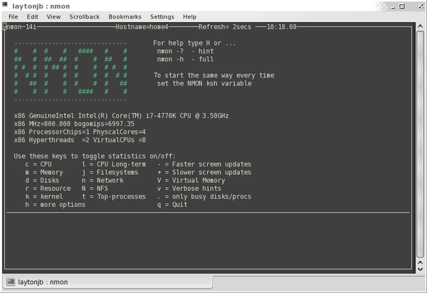 Figure 1: Nmon start-up page.
What you see is the “help” screen listing the available nmon options. When you press one of the keys corresponding to information you want, nmon presents that data. For example pressing c brings up the CPU stats of the system. To turn off the CPU stats, you just press c again.
While you are displaying the CPU stats, you could press another key to add more statistics to the display. For example, pressing the m key displays memory information while you are watching the CPU stats, and pressing the h key displays the list of options you can choose while you are displaying other information (don’t forget to press h again to turn off the help display.
To show you how this works, I ran the FT benchmark (discrete 3D fast Fourier Transform, all-to-all communication) from the NAS Parallel Benchmark OMP set version 3.2 across all of the cores on my four-core desktop system with hyperthreading turned on (e.g., a total of eight processes). Figure 2 shows the nmon display when I pressed c (CPU stats).
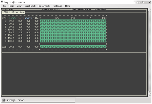 Figure 2: CPU stats while running the NPB FT benchmark.
Nmon outputs a great deal of information. On the left-hand side of the display is percent CPU usage for user, system, wait, and idle times. At the bottom of the table are the averages (Avg) for all cores. As you can see, all eight cores are really busy, with some cores hitting 100% on user applications (the FT benchmark). The average across all the cores is 99.6%, with the remaining 0.4% devoted to system time.
On the right-hand side of the display is an ASCII chart of CPU percentages for each core, with the legend running along the top of the chart. User time is shown with U’s on a green background. System, wait, and idle times would be displayed in their corresponding colors with an S, W, and I, respectively. Below the chart for each core is a chart of the average of all of the cores – that is, the system averages for user, system, wait, and idle percentages.
Another great display option for CPU stats is long-term CPU information. Figure 3 displays the long-term (l) option and the CPU stats (c) option while running the FT benchmark.
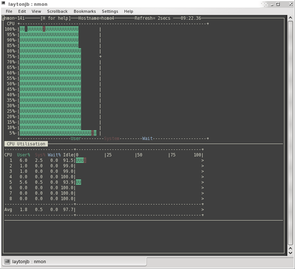 Figure 3: Long-term CPU stats while running NPB FT benchmark.
To create this chart, all I did was press the l key and then the c key to give me both charts.
The long-term CPU chart at the top is a combination of a real-time chart and a history or long-term view of the CPU stats. The y-axis is percent CPU time for user (U), system (S), wait (W), and idle (I). The x-axis is time; nmon plots the CPU stats from left to right. On the vertical line to the right, the plus sign shows where the latest data has been plotted. As the chart is updated, it moves to the right. Once it reaches the end it will come back to the beginning and continue.
In this example, I’m showing the CPU stats at the end of the run, so you can see that 100% of the CPU was devoted to user code (FT benchmark) for a while, then dropped to 80%, and then dropped to almost nothing (5%).
The bottom chart is the current CPU stats for all of the cores (c option). This chart shows you the CPU load on each core, as well as the average across all cores, at the latest instant in time (the vertical line in the top graph). You can see that the load is currently very low (FT stopped running).
Nmon can also display some interesting memory usage stats in a table that is updated at the refresh rate (two seconds by default, but it can be changed). Figure 4 shows a screen capture of nmon displaying the memory stats while FT is running.
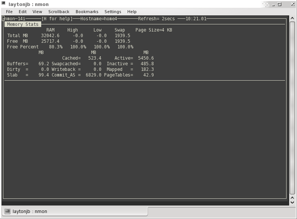 Figure 4: Memory usage during an FT run.
Nmon displays total and free memory (RAM) for the system according to the legend across the top of the table, as well as the page size (4KB). Below that it lists the free memory percent values. For both total and free RAM, the table lists high and low values (after a couple of years of using nmon I’m still not sure what these values mean, and they never seem to change), as well as swap space usage.
A second table lists how the memory is being used. The first column shows the amount of memory used for buffers, dirty pages, and slabs. In the second column is the amount memory used as cache, the amount of swap used for cache, the amount of memory used for writeback, and the commit_AS memory used. The third column lists the amount of active used, which is just about 5.45GB in my case (I’m still running FT). This is followed but the inactive amount of memory, the mapped amount of memory, and the number of page tables.
You can also use nmon to monitor the disks and the mounted filesystems. To illustrate this I ran an IOzone sequential write test against an SSD, so you should only see writes to the device and very few reads. Figure 5 shows the nmon output after I pressed d to display the disk devices.
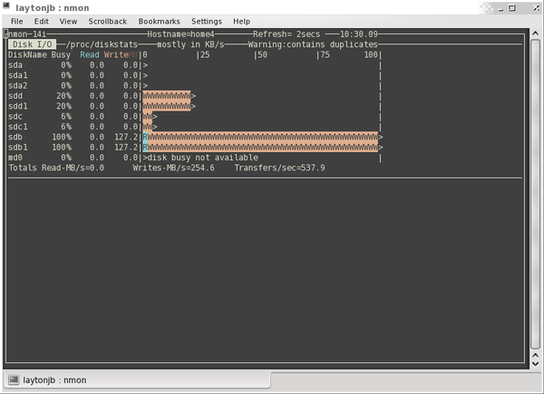 Figure 5: Disk stats during IOzone run.
The nmon display shows storage devices, partitions, and my “md” device (md0). For each device nmon shows the percent busy and the read and write throughput (I/O) statistics. In my example, you can see that device sdb and its single partition, sdb1, is writing about 127.2MBps and no reads.
One small problem occurs at the very bottom of the table: nmon lists the total read and write throughput and, for some reason, adds the throughput for sdb and sdb1 even though sdb only has one partition. As a result, nmon is reporting a total write throughput of 254.6MBps rather than 127.2MBps.
At the very end of the last line you can see the “Transfers/sec,” which you can very roughly equate to the number of I/O transfers, or sort of like IOPS (I/O operations per second).
To the right, nmon plots disk usage in an ASCII chart for each device. You can see that sdb, sdb1, sdc, sdc1, sdd, and sdd1 are all performing write I/O (the W symbol in the chart), and sdb is doing a little bit of reading (R), too, although I’m not sure why. Devices sdc1 and sdd1 are in an mdraid RAID 1 device (md0).
An alternative way of checking disk I/O stats is to use the D option, which is very similar to d except it doesn’t produce the ASCII charts. Figure 6 shows the nmon output while IOzone is running. The D option outputs a table of information rather than an ASCII plot showing the transfer details (Xfers), which as I mentioned earlier are somewhat analogous to IOPS. It also shows the I/O in-flight (KBps, last column), which can indicate whether systems are waiting on I/O.
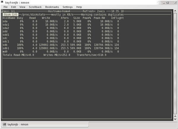 Figure 6: Disk stats during IOzone run with the D option.
On systems with lots of storage, nmon is a wonderful way to get an idea of your storage device usage. For example, NFS servers or even Hadoop nodes are great candidates to watch with nmon. The nmon j option (Figure 7) outputs information such as the size of various filesystems (SizeMB) and the amount of free space (FreeMB). Nmon refreshes this information every two seconds, although filesystem space statistics typically aren’t going to change that quickly. That said, it’s nice to be able to get a quick update of the filesystem status in nmon while watching disk usage, without having to drop out of nmon or open another window. To make sure a filesystem for some device is not filling up too quickly, I like to use d and j together.
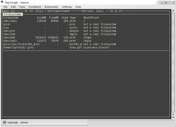 Figure 7: Filesystem status.
The t option lets you use nmon in a top fashion to look at the top processes. During IOzone testing, I added the t option to the d option to make the output a little more interesting (Figure 8). The top processes are listed in the bottom section of the output. When I did the screen capture the number 1 process was X, followed by a kernel flush process. The number 3 and 4 processes were both IOzone. (I was running two threads with IOzone.) If you see fairly high disk usage or fairly high CPU usage on the system, you can quickly add the top processes to the screen to see what might be causing the load.
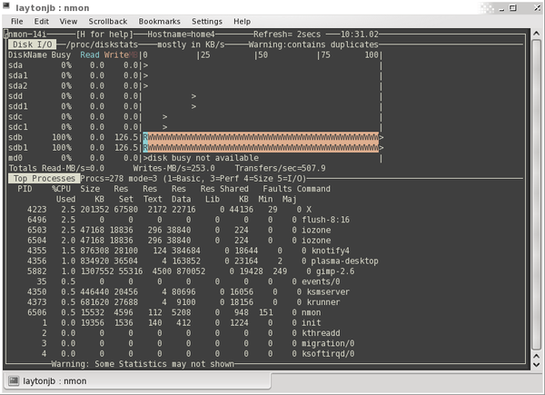 Figure 8: Disk stats and top processes.
One last option I want to cover is n, for network stats. Figure 9 shows the output from nmon while I was transferring data from the system (scp). Because I wasn’t transferring a great deal of data, the numbers won’t be too large. Nmon gives you receive (Recv) and transmit (Trans) stats in terms of throughput (KBps), as well as the number of packets in (packin), number of packets out (packout), input size (insize), and output size (outsize) for the network. The n option also shows the peak receive and transmit data while nmon has been running. Nmon updates the stats at the refresh rate for each network device, including the loopback device (lo). For my simple example, I was transmitting at about 65.4KBps, which isn’t too fast, over a simple GigE line.
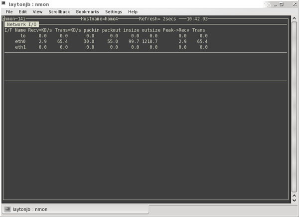 Figure 9: Network stats.