Painting by Numbers
If you want to evaluate your logfiles, you are likely to turn to a log viewing tool. In the simplest case, log viewers show you the data in tabular form; more sophisticated programs at least give a small bar, pie, or line chart. However, these graphics are mostly just a snapshot. Being able to trace the capacity of a web server over a period of time would be much more enlightening.
Gource, code_swarm, Logstalgia, Fudgie, Conky, and cpuplayer handle technical visualizations. Each of the six programs specializes in a very specific field of application. For example, Logstalgia animates access logs for a web server, whereas Gource reveals changes in a version control system. Each tool also uses a slightly different visualization format – although dots and circles seem to be pretty popular.
All candidates are designed for standard desktop PCs and are not intended for direct use on a (virtual) server. With a few exceptions, the admin has to transfer the data to be analyzed to his or her own computer. Logstalgia and Gource output their graphics via the OpenGL interface.
Gource
The content of a version control system looks like a colorful tree – at least if the admin lets Gource loose on it. When you launch Gource, you initially see small colorful balls, each corresponding to a (source) file. Their colors depend on the file type; C++ files, for example, are blue. All files located in a common directory are collected in a small heap. Gource draws the directory structure as thin white branches (Figure 1).
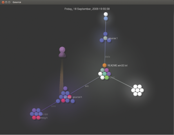 Figure 1: Gource visualizing its own SVN repository; of course, the static image does not do justice to the animation.
The developers involved in the project visualize Gource elements as avatars. They use a cone of light to illuminate the files just created or modified. A project manager or administrator can therefore easily keep track of which files the associated developer has created and modified (and when this happened) by looking at the avatar.
The visualization software draws on repositories belonging to Subversion, Git, Mercurial, and Bazaar for its purposes; however, administrators can also teach the tool to deal with other log formats.
Gource answers two questions in particular: which developers have been particularly active in the past and how the project structure has changed over time. Dense heaps of colorful dots indicate many different files in a directory and can also be an indication of a poorly structured project (Figure 2).
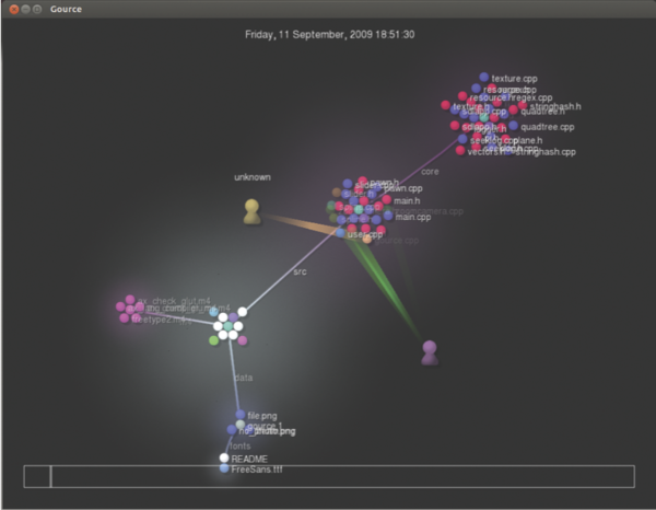 Figure 2: Even with a few files, the output of Gource can be confusingly cramped, causing the details to disappear.
This also applies to pronounced branching, which indicates a cluttered directory structure.
Finally, administrators can gain an insight into the activity of the project: If many light beams are lit, this indicates much activity. For very large projects, however, it is difficult to keep track of the bustle, despite the slow motion feature and navigation options. For example, the Linux kernel looks like a single large firework.
code_swarm
One alternative to Gource is code_swarm, which is written in Java and is already a bit long in the tooth. Its developers describe it as an “experiment in organic software visualization.” Similarly to Gource, code_swarm animates project changes in a version control system. Files appear as dots; their colors again indicate the file type (Figure 3).
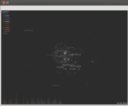 Figure 3: The graphics drawn by code_swarm visualize the files in the version control system and are reminiscent of a star chart.
When someone changes a file, the corresponding dot moves up to the name of the programmer. Code_swarm gradually hides inactive developers. Additionally, a histogram at the bottom of the screen shows previous activity; peaks indicate many changes. Unlike Gource, the graphics output is basically just confusing dot clouds. You might be able to guess from the size of the name which developer has been very diligent.
Logstalgia
If you want to see your web server playing Pong, Logstalgia is the tool for you. This small program reads and displays access logs stored on the server as small dots. They migrate from their source IP address or the domain name on the left side of the screen to the requested URL on the server on the right (Figure 4).
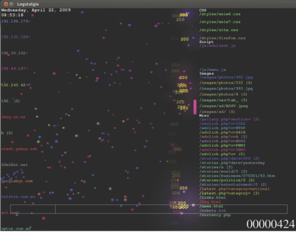 Figure 4: If the server receives too many requests, even the trained eye cannot see the forest for the trees.
Logstalgia expects the supplied logfiles in common or combined log format, as used by Apache and Nginx.
Each host is assigned a unique color, which also appears in the Logstalgia requests. Thus, the administrator can easily distinguish the dots while they move from left to right. When the web server responds to a request, a small bar hits the corresponding dot back. If a request results in an error, the dot flies beyond the right edge of the screen – in this case, the status code briefly flashes.
The Pong game runs in real time; Logstalgia mercifully skips blank periods. If you are looking at a website with only a few requests per day, you will therefore only see a few dots flit across the screen. Conversely, if you have a very high volume of visitors, you just see a confusing mess of pixels.
Even if you stop the animation with the spacebar or use the + and - keys to accelerate or slow down the action, you will still find it difficult to interpret the events. You can only see which host has made many requests and which requests for which URLs often generated error messages.
Once Logstalgia runs out of space along the right side of the screen, it summarizes the URLs; however, that prevents more detailed analysis for larger sites. At least the tool forms groups where necessary; all requested images (URLs ending with .png , .gif , or .jpg ), for example, are listed on the right side under the Images heading.
Logstalgia can also continually monitor an access log, which turns the software into an attractive monitoring tool. If you run it in a different window, you can see from the corner of your eye when the load on the server increases disproportionately, thus allowing you to intervene.
Fudgie
Fudgie is also dedicated to access logs. Its output slightly resembles that of Logstalgia: The hosts listed on the left issue their requests in the form of circles to the middle of the screen (Figure 5).
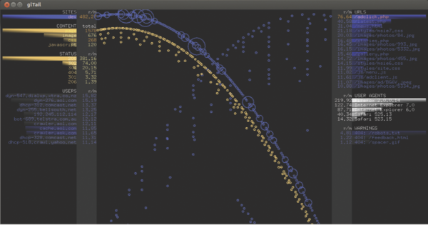 Figure 5: Fudgie fires requests to the middle of the screen as circles.
The bigger the circle, the more extensive the request. On the right side of the screen are the requested URLs, which in turn throw a circle into the middle. All the circles eventually tumble slowly through a funnel at the bottom of the screen. Additionally, Fudgie computes the number of requests made per minute. If so desired, the tool logs into the web server itself and retrieves the logfiles directly from there.
Unlike with Logstalgia, administrators cannot see which request was for which URL or whether it resulted in an error. You can only see, from the circles gathering in the funnel, which host has generated the biggest load on the server with its inquiries. Also, the most frequently requested URL generates the most circles. A very tight beam thus indicates numerous requests made in quick succession that might overload a server.
If you want to try Fudgie, be prepared for a fairly complicated installation. You need a Ruby environment with specific Ruby gems, and you have to create a configuration file in YAML format. On top of this, installing Fudgie on the current crop of distributions means some contortions and knowledge of Ruby.
Ubuntu users will need to install Ruby 1.9, declare this as the standard Ruby system, then remove a version query from the source code version of Fudgie (delete the comma in line 28 and all subsequent characters in the lib/gl_tail.rb file), and install all the gems which Fudgie then successively requests.
At the end of the day, the funnel did not work properly in our lab for this article; all of the circles dropped directly into the abyss. The Fudgie author describes his program code as “terrible,” and I would not want to argue with that.
Conky
Reams of small programs that visualize processor activity and system utilization are available on the web and in distribution repositories, in addition to matching widgets or applets for desktop environments. One, however, stands out from the crowd – the popular Conky tool, which is particularly versatile.
Unlike some of its competitors, Conky lets users influence the way processor activity or usage is displayed directly and configure this themselves. By default, the information appears as numbers, simple bars, or histograms. Conky normally writes its output directly to the desktop – more specifically to the root window (Figure 6). On request, however, Conky will present the information in a separate (transparent) window.
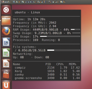 Figure 6: Conky is not exactly pretty with the simple configuration file that comes with the program.
Admins can give the presentation a lot more pep by tweaking the configuration file: From color schemes to curved bars, almost everything is configurable (Figure 7).
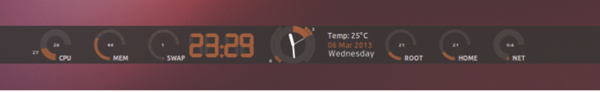 Figure 7: Conky with an appropriately customized configuration file. Admins will find any number of configuration and tuning tips on the Internet.
Examples abound on the Internet; a post by Pushakr Gaur shows a small gallery with exceptional visuals.
Henrik Brix Andersen’s brainchild was also pretty smart: The background image he chose is a drawing of his notebook, and he positioned the Conky information with arrows at the right places. Ultimately, these graphics again only contain bar charts with different degrees of curvature and cleverly placed numbers that are more difficult to read in part than their standard counterparts.
In addition to processor utilization, Conky can display and visualize much more system information, including incoming and outgoing network traffic and memory requirements. The tool logs incoming email and even lets you integrate the already aging XMMS audio player. All told, Conky offers more than 250 data sources. For more features and information providers, users can turn to Shell or Lua scripts.
By default, Conky only shows you the current data on the active system. You need to read recorded data with the help of an appropriate script, process the data, and pass it on for visualization by Conky. Conversely, Conky can record the data it displays in a logfile.
cpuplayer
Cpuplayer takes a somewhat different approach: It uses a barycentric coordinate system. Although this might sound complicated, it turns out to be a triangle, with each processor appearing as a dot (Figure 8).
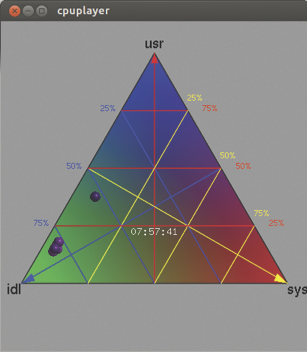 Figure 8: Cpuplayer showing four active processors, of which only one is being utilized properly.
If one of the processors is twiddling its thumbs, its point moves to the bottom left corner; if it is working hard, the dot moves up to the top. If system time utilization is high, it sits at the bottom right.
The position in the triangle clearly shows you which processors are busy, the extent of the load, and who is causing it. A colorful grid also allows fairly accurate reading of each load: you only need to determine which small lattice triangle the processor resides in, then follow the grid lines to the edge, and read the scale. The representation of a triangle is a bit unconventional, but after a short adjustment period, it can be read faster and captures the results more accurately, especially compared with the small bar charts used by the other candidates.
Unfortunately, cpuplayer cannot monitor the active system; it visualizes only previous logs, and they must be in a very specific data format. For example, if you have data logged with mpstat , you first need to reformat it using a script of your own. Cpuplayer also only shows the load changes over time: The user has to find out why the kernel is using one processor so heavily all of a sudden.
Conclusions
The programs discussed here provide somewhat fascinating insights into access logs, version management, and processor utilization. The expressiveness of the generated images and animations is limited.
At the end of the day, programs like Logstalgia with brightly colored dots that whiz around the screen are unlikely to give you more insights than perusing the very text-heavy access logs themselves, despite their appealing visuals.
Graphical log analyzers used for other tasks can give the admin a first hint of (imminent) problems. For example, if you see too many dots with 404 errors zooming past the table tennis bat in Logstalgia, it seems very likely you have something wrong with the links on a website. To discover whether this really is the case, you then need to investigate in depth with other programs.
Most of the featured programs provide movies on their websites that give administrators a pretty good overview of the feature set. Of course, it is much more fun to watch circles dropping into a funnel or see your server swatting dots than to rummage through the long columns of numbers in logfiles.
Related content
-
Visualizing log and other data
 Logfiles contain extremely useful traces of everyday events – if only they weren't so boring. Fortunately, special tools help you generate and even animate colorful, easily interpretable graphics.
Subscribe to our ADMIN Newsletters
Subscribe to our Linux Newsletters
Find Linux and Open Source Jobs
Most Popular
Focus On Self-Hosting
• Self-Hosted Collaboration with Forgejo
• Self-Hosted PaaS with Coolify
• Build and Host Docker Images
• Self-Hosted Pritunl VPN Server with MFA
• Self-Hosted Chat Servers
Support Our Work
ADMIN content is made possible with support from readers like you. Please consider contributing when you've found an article to be beneficial.