Lead Image © Gennadiy Poznyakov, 123RF.com

Lead Image © Gennadiy Poznyakov, 123RF.com

Visualizing log and other data

Painting by Numbers

Article from ADMIN 17/2013
By
Logfiles contain extremely useful traces of everyday events – if only they weren't so boring. Fortunately, special tools help you generate and even animate colorful, easily interpretable graphics.

If you want to evaluate your logfiles, you are likely to turn to a log viewing tool. In the simplest case, log viewers show you the data in tabular form; more sophisticated programs at least give a small bar, pie, or line chart. However, these graphics are mostly just a snapshot. Being able to trace the capacity of a web server over a period of time would be much more enlightening.

Gource, code_swarm, Logstalgia, Fudgie, Conky, and cpuplayer handle technical visualizations. Each of the six programs specializes in a very specific field of application. For example, Logstalgia animates access logs for a web server, whereas Gource reveals changes in a version control system. Each tool also uses a slightly different visualization format – although dots and circles seem to be pretty popular.

All candidates are designed for standard desktop PCs and are not intended for direct use on a (virtual) server. With a few exceptions, the admin has to transfer the data to be analyzed to his or her own computer. Logstalgia and Gource output their graphics via the OpenGL interface.

Gource

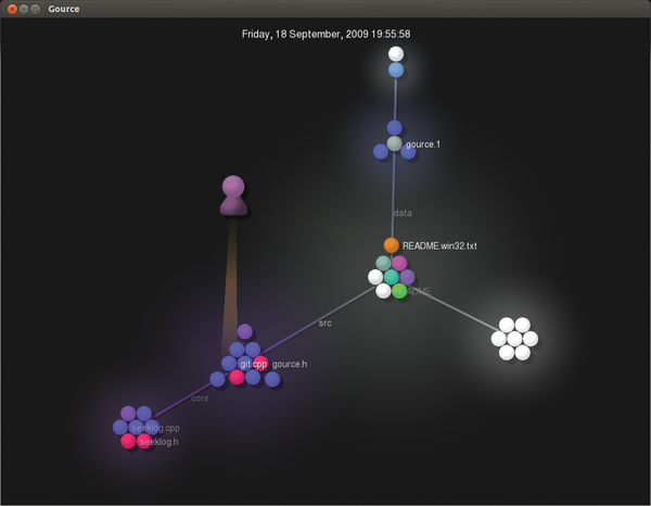
The content of a version control system looks like a colorful tree – at least if the admin lets Gource [1] loose on it. When you launch Gource, you initially see small colorful balls, each corresponding to a (source) file. Their colors depend on the file type; C++ files, for example, are blue. All files located in a common directory are collected in a small heap. Gource draws the directory structure as thin white branches (Figure 1).

Figure 1: Gource visualizing its own SVN repository; of course, the static image does not do justice to the animation.

The developers involved in the project visualize Gource elements as avatars. They use a cone of light to illuminate the files just created or modified. A project manager or administrator can therefore easily keep track of which files the associated developer has created and modified (and when this happened) by looking at the avatar.

The visualization software draws on repositories belonging to Subversion, Git, Mercurial, and Bazaar for its purposes; however, administrators can also teach the tool to deal with other log formats [2].

Gource answers two questions in particular: which developers have been particularly active in the past and how the project structure has changed over time. Dense heaps of colorful dots indicate many different files in a directory and can also be an indication of a poorly structured project (Figure 2). This also applies to pronounced branching, which indicates a cluttered directory structure.

Figure 2: Even with a few files, the output of Gource can be confusingly cramped, causing the details to disappear.

Finally, administrators can gain an insight into the activity of the project: If many light beams are lit, this indicates much activity. For very large projects, however, it is difficult to keep track of the bustle, despite the slow motion feature and navigation options. For example, the Linux kernel looks like a single large firework.

code_swarm

One alternative to Gource is code_swarm, which is written in Java and is already a bit long in the tooth. Its developers describe it as an "experiment in organic software visualization" [3]. Similarly to Gource, code_swarm animates project changes in a version control system. Files appear as dots; their colors again indicate the file type (Figure 3).

Figure 3: The graphics drawn by code_swarm visualize the files in the version control system and are reminiscent of a star chart.

When someone changes a file, the corresponding dot moves up to the name of the programmer. Code_swarm gradually hides inactive developers.

Additionally, a histogram at the bottom of the screen shows previous activity; peaks indicate many changes. Unlike Gource, the graphics output is basically just confusing dot clouds. You might be able to guess from the size of the name which developer has been very diligent.

Logstalgia

If you want to see your web server playing Pong, Logstalgia [4] is the tool for you. This small program reads and displays access logs stored on the server as small dots. They migrate from their source IP address or the domain name on the left side of the screen to the requested URL on the server on the right (Figure 4).

Figure 4: If the server receives too many requests, even the trained eye cannot see the forest for the trees.

Logstalgia expects the supplied logfiles in common or combined log format, as used by Apache and Nginx.

Each host is assigned a unique color, which also appears in the Logstalgia requests. Thus, the administrator can easily distinguish the dots while they move from left to right. When the web server responds to a request, a small bar hits the corresponding dot back. If a request results in an error, the dot flies beyond the right edge of the screen – in this case, the status code briefly flashes.

The Pong game runs in real time; Logstalgia mercifully skips blank periods. If you are looking at a website with only a few requests per day, you will therefore only see a few dots flit across the screen. Conversely, if you have a very high volume of visitors, you just see a confusing mess of pixels.

Even if you stop the animation with the spacebar or use the + and - keys to accelerate or slow down the action, you will still find it difficult to interpret the events. You can only see which host has made many requests and which requests for which URLs often generated error messages.

Once Logstalgia runs out of space along the right side of the screen, it summarizes the URLs; however, that prevents more detailed analysis for larger sites. At least the tool forms groups where necessary; all requested images (URLs ending with .png, .gif, or .jpg), for example, are listed on the right side under the Images heading.

Logstalgia can also continually monitor an access log, which turns the software into an attractive monitoring tool. If you run it in a different window, you can see from the corner of your eye when the load on the server increases disproportionately, thus allowing you to intervene.

Buy ADMIN Magazine

SINGLE ISSUES
 
SUBSCRIPTIONS
 
TABLET & SMARTPHONE APPS
Get it on Google Play

US / Canada

Get it on Google Play

UK / Australia

Related content

  • Data Visualization Tools

    Logfiles contain extremely useful traces of everyday events – if only they weren’t so boring. Fortunately, special tools help you generate and even animate colorful, easily interpretable graphics.

comments powered by Disqus
Subscribe to our ADMIN Newsletters
Subscribe to our Linux Newsletters
Find Linux and Open Source Jobs


Support Our Work

ADMIN content is made possible with support from readers like you. Please consider contributing when you've found an article to be beneficial.

Learn More”>
	</a>

<hr>		    
			</div>
		    		</div>

		<div class=